
Tutorial 3 — Advanced Plotting: Custom Figures#
ForMoSA’s analysis.plot(results) is a convenient command to get corner, chains, radar, and best-fit plots all at once with default styling. Although, for publication or presentation work, you might typically want to (a) generate only the plot you need and (b) customize colors, fonts, labels, and legends.
This notebook covers all four plot types.
What you’ll learn:
How to configure matplotlib globally with
rcParamsand locally withrc_contextThree methods for loading ForMoSA nested-sampling results
How to generate each plot type individually (best-fit, corner, radar, chains)
The three config layers:
PLOTS_CONFIG, per-observationplot_config, andMAIN_PLOTHow to post-process matplotlib
Figure/Axesobjects for fine controlHow to save publication-quality figures (PDF/PNG)
No fitting required. This tutorial loads pre-computed results from the results/ folder committed alongside this notebook.
Estimated runtime: < 1 minute (no nested sampling).
Prerequisites: ForMoSA v2.0 installed. Familiarity with Tutorial 5 is helpful but not required.
Section 0: Setup#
[1]:
import sys
try:
    import ForMoSA
    print(f"ForMoSA {ForMoSA.__version__} — OK")
except ImportError:
    raise ImportError("pip install ForMoSA && conda install dask netCDF4 bottleneck")
print(f"Python {sys.version.split()[0]}")
ForMoSA 2.0.0 — OK
Python 3.11.13
0.1: Matplotlib global styling with rcParams#
rcParams is matplotlib’s global settings dictionary. Set it once at the top of the notebook and every plot you create afterwards inherits those values — fonts, line widths, tick direction, DPI, and more. This is cleaner than repeating styling in every plt.X call.
For one-off overrides (a single figure in a different style), use plt.rc_context(...) — it applies your changes only inside the with block and reverts them on exit.
[2]:
import matplotlib.pyplot as plt

plt.rcParams.update({
    'font.size':        20,
    'font.family':      'serif',
    'font.serif':       ['Times New Roman', 'DejaVu Serif'],
    'mathtext.fontset': 'cm',         # Computer Modern math (LaTeX-like, no LaTeX install)
    'axes.linewidth':   1.5,
    'xtick.labelsize':  16,
    'ytick.labelsize':  16,
    'xtick.direction':  'in',
    'ytick.direction':  'in',
    'legend.fontsize':  18,
    'legend.frameon':   False,
    'figure.dpi':       300,
    'savefig.dpi':      300,
    'text.usetex':      True,       # Set to True if you have LaTeX installed and want LaTeX rendering
})
print("rcParams set — all subsequent plots will inherit these defaults.")
rcParams set — all subsequent plots will inherit these defaults.
Scoped overrides with rc_context#
If you want different fonts or styles for just one figure, wrap it in a context manager:
with plt.rc_context({'font.size': 18, 'lines.linewidth': 2.0}):
    fig = plots.plot_corner()   # uses the overrides
# back to global defaults outside the block
LaTeX rendering#
Two paths:
mathtext.fontset='cm'(set above): renders$...$math in Computer Modern. No LaTeX install needed. Recommended default.plt.rcParams['text.usetex'] = True: delegates to your system’s LaTeX binary. Slower and requires a working install, but lets you use arbitrary LaTeX packages (e.g.\textsc, custom fonts) anywhere in a label string.
Section 1: Loading results#
ForMoSA stores fit output in two parallel files inside your result_path:
NS_results/results_<algo>.json— theNSResultsobject (samples, weights, log-likelihoods, log-evidence, etc.)NS_params/NS_params.json— the nested-sampling configuration used for the run
Three loading patterns are shown below. Choose the one that matches what you have and what you want to plot.
Method A — NSResults from JSON (fastest; corner, chains, radar only)#
This is the quickest path and sufficient for every plot except the best-fit spectrum (which needs the adapted model grid and the observations on disk too — see Method C). Use this when you just want to explore or customise your posterior plots.
[3]:
import json
from pathlib import Path

from ForMoSA.nested_sampling.results  import NSResults
from ForMoSA.nested_sampling.plotting import Plotting

# Path to the pre-computed results included with this tutorial.
# If you are using your own fit, replace this with:
#   Path("/absolute/path/to/your/result_path") / "NS_results" / "results_pymultinest.json"
RESULTS_JSON = Path(".").resolve() / "results" / "NS_results" / "results_pymultinest.json"

if not RESULTS_JSON.exists():
    raise FileNotFoundError(
        f"Results file not found: {RESULTS_JSON}\n"
        "Make sure you are running this notebook from the plotting/ directory,\n"
        "or update RESULTS_JSON to point to your own result_path."
    )

with open(RESULTS_JSON) as f:
    data = json.load(f)

results = NSResults.from_dict(data)

plots  = Plotting(results, logger=None, log_level='ERROR')

print(f"Results loaded: {results.samples.shape[0]} total samples")
print(f"Free parameters: {results.free_parameters}")
print(f"Burn-in index: {results.burn_in} (samples before this index are discarded)")

# print("Method A: uncomment the block above and fill in your config paths to use this method.")
Results loaded: 1063 total samples
Free parameters: ['Teff', 'log(g)', 'rv']
Burn-in index: 0 (samples before this index are discarded)
Method B — Directly from raw PyMultiNest output files#
Use this if you only have the raw PyMultiNest output directory (RAW_.txt, RAW_ev.dat, RAW_stats.dat) but not the JSON. You need to tell ForMoSA which parameters you fitted so it can label the columns correctly.
[ ]:
# Uncomment and fill in your paths to use this method.

# from ForMoSA.nested_sampling.results import NSResults

# PYMULTINEST_DIR = Path(".").resolve() / "results" / "pymultinest"
# FREE_PARAMETERS = ['Teff', 'logg', 'M_H', 'C_O', 'r', 'd']   # match your fit exactly

# results = NSResults.from_pymultinest(
#     results_path    = str(PYMULTINEST_DIR),
#     free_parameters = FREE_PARAMETERS,
# )
print("Method B: uncomment the block above and fill in your paths to use this method.")
Method C — Full Analysis reload (required for the best-fit plot)#
The best-fit spectrum plot needs more than just the posterior samples — it needs the adapted model grid and the observation spectra that were used during the fit, plus the best-fit model evaluated at the posterior median. All of this lives in the Analysis object.
Setting fitted=True tells ForMoSA to skip the nested sampling run and instead reconstruct analysis.ns and analysis.ns_analysis from the files already on disk. Setting adapted=True skips the grid adaptation step too. Both must be True when loading a completed fit.
[8]:
# Uncomment and fill in your config to use this method.
# This requires the adapted grid files to be present in adapt_store_path.

from ForMoSA.analysis import Analysis
from ForMoSA.config.global_config import ConfigLoader

# load the config to get the paths and settings for this fit
TUTORIAL_DIR = Path("../spectroscopy/abpicb").resolve()
print(f"Config directory: {TUTORIAL_DIR}")
cfg = ConfigLoader(str(TUTORIAL_DIR/'spectro_config.ini'))

# initialize the Analysis object with adapted=True and fitted=True to load the results from disk
analysis = Analysis(
    config_path = cfg.load()['config_path'],
    adapted     = True,     # adaptation already done on disk — don't redo it
    fitted      = True,     # NS already run — load results from result_path
    log_level   = 'ERROR',  # only log errors to avoid cluttering the output (default is 'INFO')
)

# the results are now available as analysis.ns.results, which is an NSResults object
results = analysis.ns.results
# creating the Plotting object from the loaded results
plots  = Plotting(results, analysis.logger, log_level='ERROR')

print(f"Results loaded: {results.samples.shape[0]} total samples")
print(f"Free parameters: {results.free_parameters}")
print(f"Burn-in index: {results.burn_in} (samples before this index are discarded)")

# print("Method C: uncomment the block above and fill in your config paths to use this method.")
Config directory: /Users/rajpoot/Karmabhumi/Packages/ForMoSA/docs/tutorials/spectroscopy/abpicb
INFO Config file loaded
Results loaded: 1063 total samples
Free parameters: ['Teff', 'log(g)', 'rv']
Burn-in index: 0 (samples before this index are discarded)
Section 2: Best-fit spectrum plot#
The best-fit plot requires a full Analysis object loaded via Method C above — it needs the adapted model grid and best-fit spectra, not just the posterior samples.
The subsections below show all the customisation options. Run them after loading analysis and building ns_analysis from Method C.
Section 2.1: Calling only the best-fit plot#
analysis.plot(results) runs all four plot types at once. To generate just the best-fit spectrum, bypass it and call plots.plot_fit(...) directly. NSAnalysis computes the best-fit spectrum — the model evaluated at the weighted posterior median parameters.
[10]:
# Requires Method C above. Uncomment after loading analysis.

from ForMoSA.nested_sampling.plotting import Plotting
from ForMoSA.nested_sampling.ns_analysis import NSAnalysis

ns_analysis = NSAnalysis(analysis.ns, log_level='ERROR')
plots_bf    = Plotting(analysis.ns.results, analysis.logger, log_level='ERROR')

fig, ax, ax_filt, axr, axr2 = plots_bf.plot_fit(
    analysis.ns.restricted_observations,
    ns_analysis.best_fit,
)
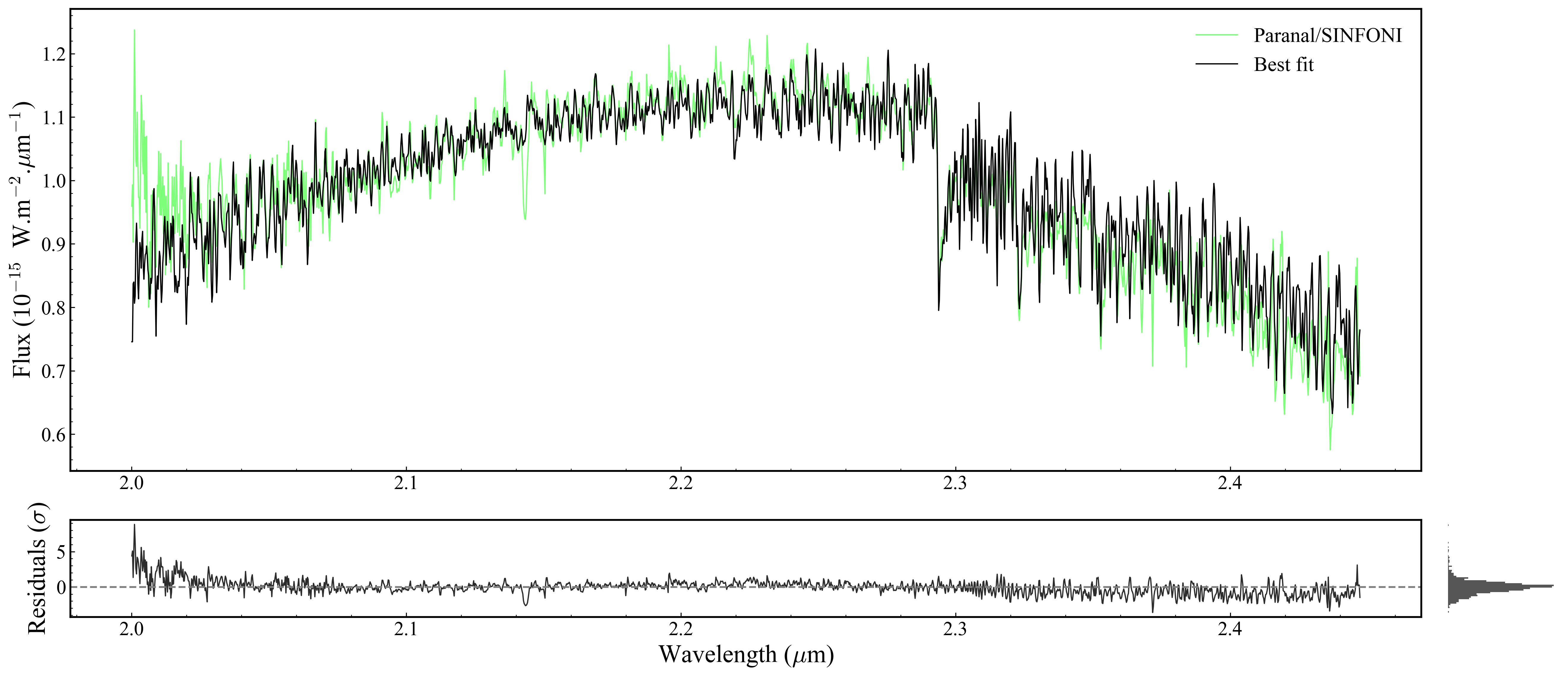
Returned objects:
fig— the matplotlibFigureax— main spectrum panelax_filt— photometric filter transmission panel (Noneif no photometry)axr— residuals panel (bottom)axr2— residual histogram (right ofaxr)
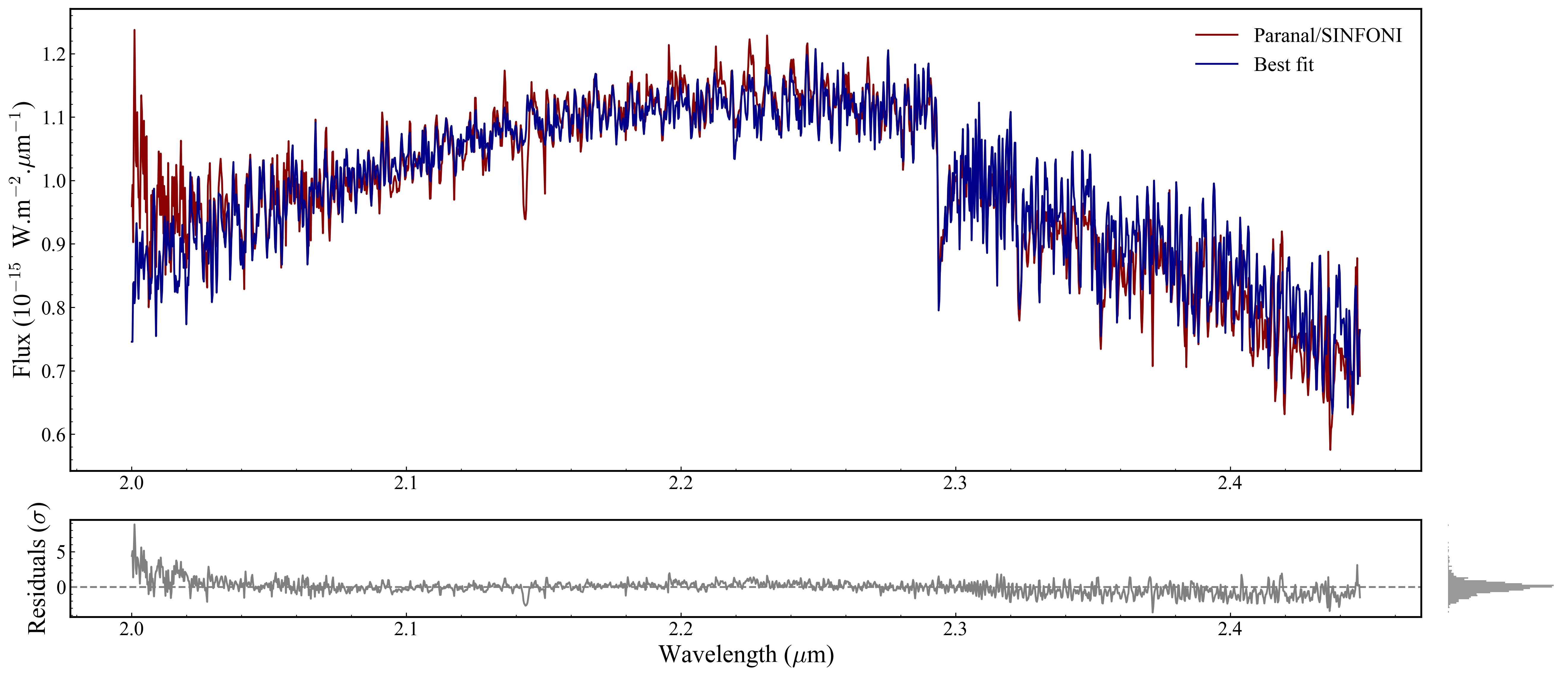
Section 2.2: Customising the best-fit line#
PLOTS_CONFIG.BestFitPlot is a dataclass that controls the appearance of the model line and residuals. Set it before calling plot_fit — it won’t apply retroactively.
Available fields: color_fit, color_residuals, linewidth, zorder. There is no alpha field in the dataclass — for transparency, edit post-hoc (Section 2.5).
[27]:
from ForMoSA.core.config import PLOTS_CONFIG

PLOTS_CONFIG.BestFitPlot.set_best_fit_plot_config(
    color_fit       = 'darkblue',   # warm orange for the model line
    color_residuals = 'gray',   # near-black for residuals
    linewidth       = 1.5,
    zorder          = 200,         # draw model on top of data points
)
print("BestFitPlot config set. Calling plots_bf.plot_fit(...) to apply.")

plots_bf.plot_fit(
    analysis.ns.restricted_observations,
    ns_analysis.best_fit,
);
BestFitPlot config set. Calling plots_bf.plot_fit(...) to apply.
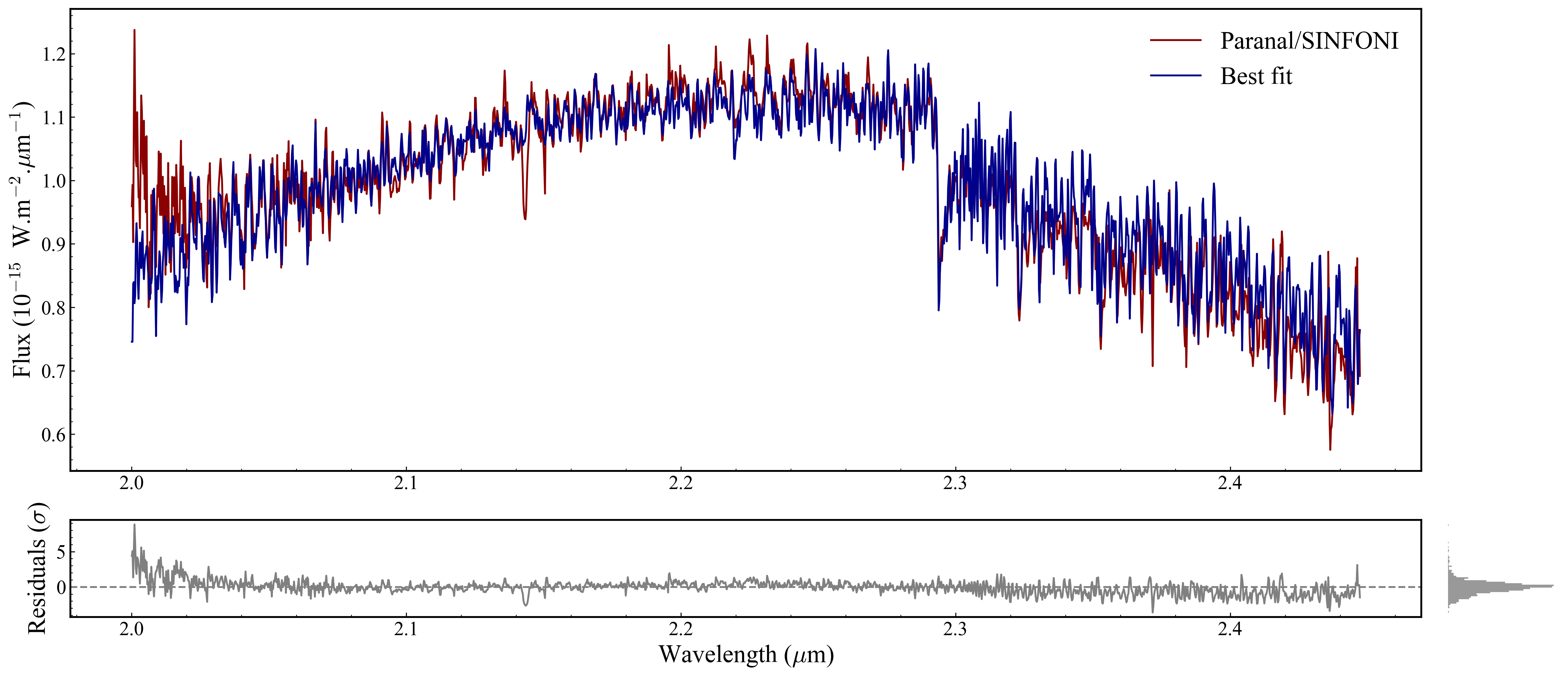
Section 2.3: Customising each observation’s colour#
Every Observation object owns its own plot_config. Therefore, it requires iterating over analysis.ns.restricted_observations and call set_plot_config(...) on each observation.
This becomes crucial when you have multiple observation either from same instrument or in a multi-instrument (MOSAIC) fit, as each observation is plotted on the same axes.
The name for each observation can be accessed by: analysis.ns.restricted_observations.observation_names
Fields available from ObsPlotConfig: color, edgecolor, marker, markersize, linewidth, errorbar_fmt, errorbar_alpha, errorbar_capsize, zorder_data, zorder_error, label.
[28]:
# Example: assign distinct colors by observation name.

custom_colors = {
    '[Paranal]_[SINFONI]':   'darkred',
}

for obs in analysis.ns.restricted_observations:
    obs.plot_config.set_plot_config(
        color          = custom_colors.get(obs.name, obs.plot_config.color),
        linewidth      = 1.5,
        errorbar_alpha = 0.8,   # make error bars slightly transparent
    )

plots_bf.plot_fit(
    analysis.ns.restricted_observations,
    ns_analysis.best_fit,
);

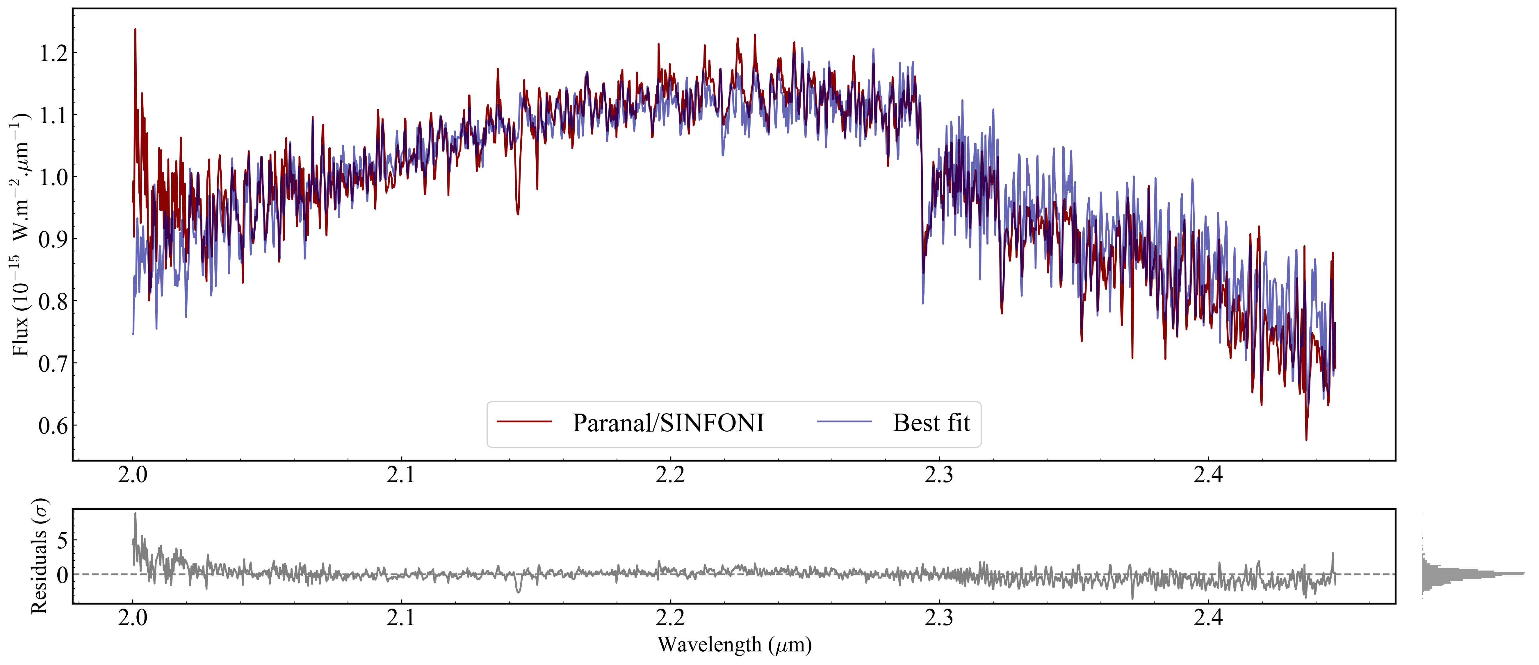
Section 2.4: Figure-wide configuration (MAIN_PLOT)#
MAIN_PLOT controls global layout properties that apply to the whole figure, not to a single plot type. Set it before calling any plot function.
[31]:
from ForMoSA.core.config import MAIN_PLOT

MAIN_PLOT.figsize         = (20, 9)    # wider figure for multi-instrument fits
MAIN_PLOT.legend_fontsize = 20
MAIN_PLOT.minor_ticks     = True
MAIN_PLOT.nb_minor_ticks  = 5         # number of minor ticks between major ticks
print("MAIN_PLOT config set.")

plots_bf.plot_fit(
    analysis.ns.restricted_observations,
    ns_analysis.best_fit,
);
MAIN_PLOT config set.
Section 2.5: Post-hoc axis tweaks#
ForMoSA’s config dataclasses don’t expose everything — axis-label font sizes, tick label sizes, and best-fit-line alpha are not in the dataclass. You can set these directly on the matplotlib Axes objects returned by plot_fit.
This is standard matplotlib: once you have an Axes, you can change anything.
[37]:
# After calling plot_fit, you can further customize the axes and legend using standard Matplotlib commands.
fig, ax, ax_filt, axr, axr2 = plots_bf.plot_fit(
    analysis.ns.restricted_observations,
    ns_analysis.best_fit,
)

for a in [ax, axr]:
    a.tick_params(labelsize=20)
    a.xaxis.label.set_size(18)
    a.yaxis.label.set_size(18)

# Apply alpha to the best-fit line (not in the config dataclass)
for line in ax.get_lines():
    if line.get_label() == 'Best fit':
        line.set_alpha(0.6)

# Redraw legend with explicit styling
handles, labels = ax.get_legend_handles_labels()
ax.legend(handles, labels, frameon=True, ncols=2, loc='lower center', fontsize=22);
Section 2.6: Parameter values in the legend#
results.median_parameters gives the weighted posterior median for each free parameter as a dict[str, float]. _interval(sigma=1) gives the ±1σ asymmetric credible interval as dict[str, (low, high)]. Use these to build a formatted legend entry that shows the best-fit values directly in the plot.
[46]:
import numpy as np

medians   = results.median_parameters
intervals = results._interval(sigma=1)

parts = []
for k, med in medians.items():
    lo, hi = intervals[k]
    parts.append(f'{k}=${med:.2f}_{{-{med-lo:.2f}}}^{{+{hi-med:.2f}}}$')

new_label = 'Best fit:  ' + ',  '.join(parts)
print("Legend label that would be applied:")
print(new_label)

# To apply it to the figure (requires Method C):
for line in ax.get_lines():
    if line.get_label() == 'Best fit':
        line.set_label(new_label)
handles, labels = ax.get_legend_handles_labels()
ax.legend(handles, labels, frameon=False, ncols=1, loc='lower center', fontsize=24)

fig
Legend label that would be applied:
Best fit:  Teff=$1480.15_{-1.31}^{+1.36}$,  log(g)=$2.74_{-0.01}^{+0.02}$,  rv=$20.84_{-0.85}^{+0.90}$
[46]:
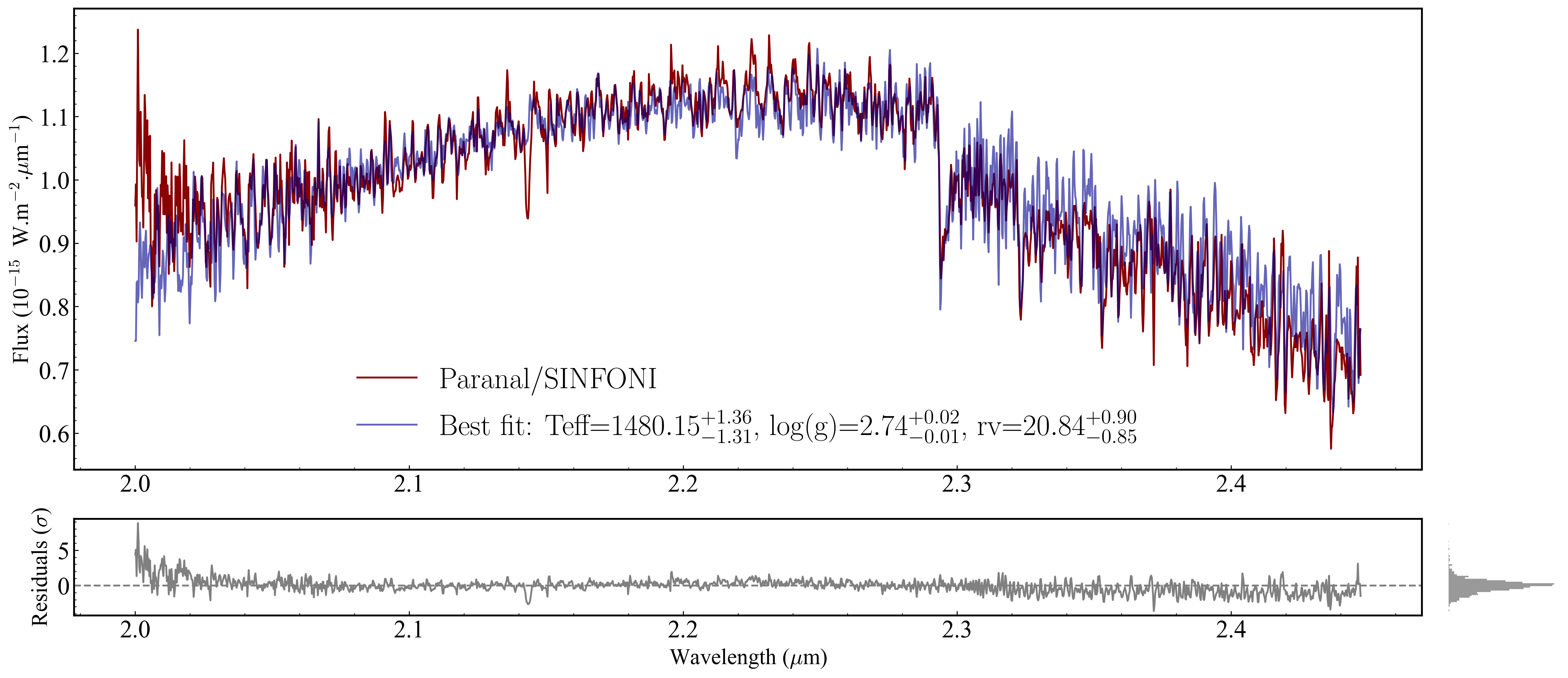
Section 2.7: Plotting posterior uncertainty bands (1σ, 2σ)#
ns_analysis.best_fit_interval(perc=...) returns the lower and upper envelope of the model at the given posterior credible level. Use fill_between to shade the band on the spectrum axis.
Note:
best_fit_intervalmay return fluxes in native-model space rather than observation space for some setups. If the lengths don’t match your observation’s wavelength grid, usens_analysis.native_best_fitinstead, or draw samples manually (commented fallback below).
[47]:
# Requires Method C and a live ns_analysis object.

# computing the 1-sigma and 2-sigma intervals for the best fit using ns_analysis
lower_1, higher_1 = ns_analysis.best_fit_interval(perc=0.68)
lower_2, higher_2 = ns_analysis.best_fit_interval(perc=0.95)

ax.fill_between(lower_1.wave, lower_1.flux, higher_1.flux,
                color='grey', alpha=0.4, zorder=150, label='1$\\sigma$')
ax.fill_between(lower_2.wave, lower_2.flux, higher_2.flux,
                color='grey', alpha=0.2, zorder=140, label='2$\\sigma$')
ax.legend(*ax.get_legend_handles_labels(), frameon=False, loc='upper right', fontsize=11)

fig
100%|██████████| 1063/1063 [02:15<00:00, 7.87it/s]
---------------------------------------------------------------------------
ValueError                                Traceback (most recent call last)
Cell In[47], line 3
      1 # Requires Method C and a live ns_analysis object.
----> 3 lower_1, higher_1 = ns_analysis.best_fit_interval(perc=0.68)
      4 lower_2, higher_2 = ns_analysis.best_fit_interval(perc=0.95)
      6 ax.fill_between(lower_1.wave, lower_1.flux, higher_1.flux,
      7                 color='grey', alpha=0.4, zorder=150, label='1$\\sigma$')

File ~/Karmabhumi/Packages/ForMoSA/ForMoSA/nested_sampling/ns_analysis.py:251, in NSAnalysis.best_fit_interval(self, perc)
    248     observed_model = self._build_native_observed_model(grid, sample, print_logger=False)
    249     models_flux.append(observed_model.flux)
--> 251 models_flux = np.array(models_flux)
    252 perc_1sigma_lower = get_weighted_percentile(lower * 100, models_flux, weights=self.ns.results.weights[self.ns.results.burn_in:])
    253 perc_1sigma_higher = get_weighted_percentile(upper * 100, models_flux, weights=self.ns.results.weights[self.ns.results.burn_in:])

ValueError: setting an array element with a sequence. The requested array has an inhomogeneous shape after 1 dimensions. The detected shape was (1063,) + inhomogeneous part.
[ ]:
# --- Fallback: manual quantile band by weighted posterior sampling ---
# import numpy as np

# n_draws = 500
# w       = results.weights[results.burn_in:]
# w_norm  = w / w.sum()
# idx     = np.random.choice(len(w_norm), size=n_draws, p=w_norm, replace=True)
# draws   = results.samples[results.burn_in:][idx]

# # For each draw, evaluate your model here and collect fluxes into an array.
# fluxes = np.array([your_model(params) for params in draws])
# lo1, hi1 = np.quantile(fluxes, [0.16, 0.84], axis=0)
# lo2, hi2 = np.quantile(fluxes, [0.025, 0.975], axis=0)
# ax.fill_between(wave_grid, lo1, hi1, color='grey', alpha=0.4)
# ax.fill_between(wave_grid, lo2, hi2, color='grey', alpha=0.2)
2.8 Interactive view#
%matplotlib widget works in VS Code’s Jupyter extension once ipympl is installed:
pip install ipympl
Then in the notebook:
[49]:
# Switch backends
# interactive: pan, zoom, hover coordinates
%matplotlib widget

# Now re-render the plot to get the interactive figure
fig, ax, ax_filt, axr, axr2 = plots.plot_fit(
    analysis.ns.restricted_observations,
    ns_analysis.best_fit,
)
[50]:
# revert to static for the rest of the tutorial
%matplotlib inline
2.9 Plotting a model at custom parameter values#
Deferred. Generating a forward-model spectrum at arbitrary (Teff, logg, [M/H], ...) requires tracing the v2.0.0 grid-interpolation API (SubGrid interpolation + ObservedModel evaluation). I’ll add this section in a follow-up once I’ve worked through the source.
Section 3: Corner plot#
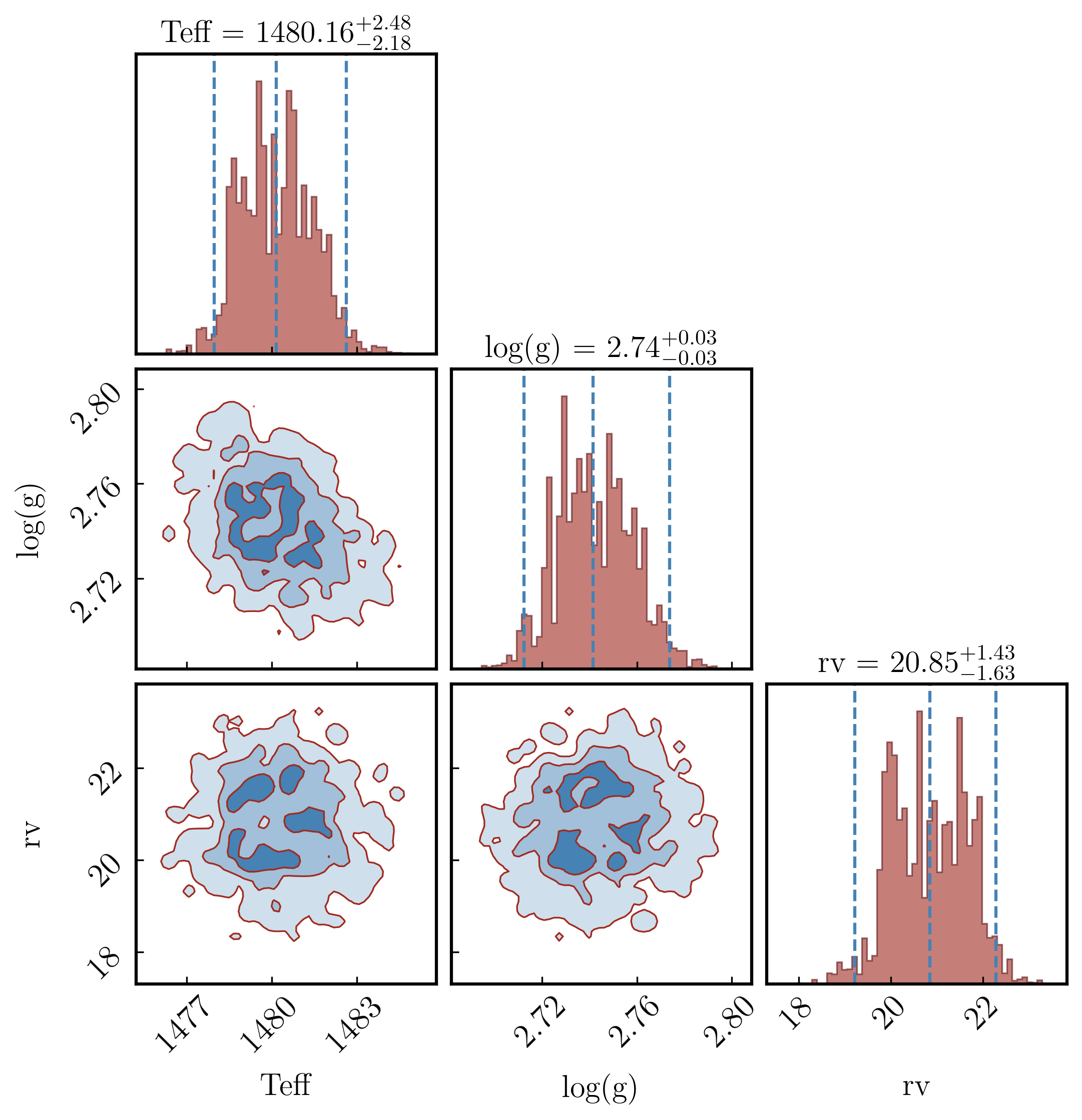
A corner plot shows every pair of parameters as a 2D contour (off-diagonal panels) and each parameter’s marginal posterior as a 1D histogram (diagonal panels). It is the standard way to visualise parameter correlations and posterior shapes in Bayesian fitting.
Plotting.plot_corner() is a thin wrapper around the `corner <https://corner.readthedocs.io>`__ library. The dataclass PLOTS_CONFIG.CornerPlot exposes most of corner.corner’s arguments.
The Plotting object (plots) can be created from results in Section 1 (Method A). We use it for all remaining plot types.
Section 3.1: Colors, contours, and fills#
fill_contours=True shades the interior of each contour level. plot_density=True adds a 2D density colour map behind the contours. smooth applies a Gaussian filter in pixels — higher values give smoother contours but can blur real structure; 0.5–1.5 is a typical range. levels sets the 2D credible regions to draw; the values below correspond to 1σ, 2σ, and 3σ for a 2D Gaussian.
[58]:
from ForMoSA.core.config import PLOTS_CONFIG

PLOTS_CONFIG.CornerPlot.set_corner_plot_config(
    bins          = 60,
    color         = 'steelblue', # contour + histogram colour

    fill_contours = True,
    plot_density  = True,
    plot_contours = True,

    smooth        = 1.2, # Gaussian smoothing of 2D contours (0 = none)
    levels        = [0.3935, 0.8647, 0.9889],   # 1σ / 2σ / 3σ for a 2D Gaussian
    quantiles     = (0.16, 0.5, 0.84),  # vertical lines in 1D histograms

    hist_kwargs     = {'color': '#A12A1F', 'histtype': 'stepfilled', 'alpha': 0.6, 'edgecolor': '#5B1218', 'linewidth': 0.8},
    contour_kwargs  = {'colors': '#A12A1F', 'linewidths': 0.8},
    pcolor_kwargs   = {'color': '#5B1218'},
)

fig_corner = plots.plot_corner()

Section 3.2: Fonts and label sizes#
title_kwargs and label_kwargs are passed directly to corner.corner. title_fmt controls the format string used in the median ± σ titles on the diagonal. max_n_ticks limits how many tick marks appear on each axis (useful for crowded corners).
[59]:
PLOTS_CONFIG.CornerPlot.set_corner_plot_config(
    title_kwargs = dict(fontsize=15),
    label_kwargs = dict(fontsize=15),
    title_fmt    = '.2f',
    max_n_ticks  = 4,
)

fig_corner = plots.plot_corner()

Section 3.3: Replacing parameter labels with custom LaTeX names#
corner takes its labels from results.free_parameters (plain strings like Teff). To use LaTeX labels (e.g. \(T_{\rm eff}\)), build the figure first, then overwrite the axis labels on the returned Axes grid.
The corner figure has n × n axes in a square grid. The bottom row holds x-labels; the leftmost column holds y-labels (skip the [0, 0] panel — it’s a 1D histogram with no y-label). Adjust custom_labels to match your free_parameters in order.
[60]:
import numpy as np

n = len(results.free_parameters)
print(f"Free parameters ({n}): {results.free_parameters}")

# Replace these with your own LaTeX labels in the same order as free_parameters
custom_labels = [
    r'$T_{\mathrm{eff}}$ (K)',
    r'$\log g$',
    r'RV (km/s)',
][:n]   # truncate to match actual number of free parameters

fig_corner = plots.plot_corner()
axes = np.array(fig_corner.axes).reshape((n, n))

# Bottom row: x-labels
for i in range(n):
    axes[-1, i].set_xlabel(custom_labels[i], fontsize=15)

# Leftmost column: y-labels (skip the [0,0] diagonal histogram)
for i in range(1, n):
    axes[i, 0].set_ylabel(custom_labels[i], fontsize=15)
Free parameters (3): ['Teff', 'log(g)', 'rv']

Section 3.4: Quantile lines on the diagonal#
The dashed vertical lines on the diagonal histograms mark specific posterior quantiles. The default (0.16, 0.5, 0.84) corresponds to the median and ±1σ. Change them to (0.025, 0.5, 0.975) for a ±2σ (95%) interval. show_titles=True prints the median and interval above each diagonal panel.
[61]:
PLOTS_CONFIG.CornerPlot.set_corner_plot_config(
    quantiles   = (0.025, 0.5, 0.975),   # 95% credible interval
    show_titles = True,
)

fig_corner = plots.plot_corner()
Section 3.5: Zooming into specific panels#
Corner uses the data range, weighted. If you need to override the range on a particular panel (e.g. clip a long posterior tail):
[ ]:
axes = np.array(fig_corner.axes).reshape((n, n))

# Example: clip Teff range on the (0,0) histogram and on every panel that uses Teff
# axes[0, 0].set_xlim(1000, 2000)
# for i in range(1, n):
#     axes[i, 0].set_xlim(1000, 2000)     # left column = Teff x-axis
#     axes[0, i].set_ylim(0, None)        # top row = Teff y-axis (only if symmetric)
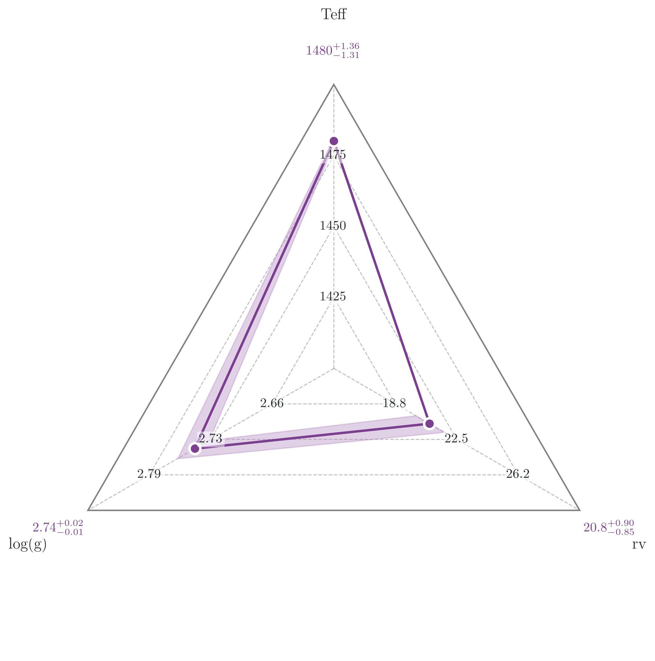
Section 4: Radar plot#
The radar plot shows every free parameter on a separate radial axis, all normalised to [0, 1] relative to their sample range. The filled polygon marks the median ± your chosen quantile interval. It gives a compact at-a-glance view of which parameters are tightly constrained versus which still span most of their prior.
Known source typo: The
RadarPlotConfigdataclass has a misspelling in the ForMoSA source: the field isfontisze_ticks(notfontsize_ticks). Use the misspelled name or the call will silently ignore your value.
[12]:
from ForMoSA.core.config import PLOTS_CONFIG

PLOTS_CONFIG.RadarPlot.set_radar_plot_config(
    color_radar        = '#7B3F8F',
    color_uncertainty  = '#B58CC2',
    color_quantiles    = '#7B3F8F',
    alpha_fill         = 0.4,
    linewidth          = 2.0,
    fontsize_names     = 13,
    fontsize_ticks     = 11,         # note: typo is in the ForMoSA source
    color_ticks        = '#24292E',
    show_ticks         = True,
    quantiles          = (0.16, 0.84),
    size_quantiles     = 80,
    lw_quantiles       = 2.0,
)

fig_radar, ax_radar = plots.plot_radars()
plt.show()
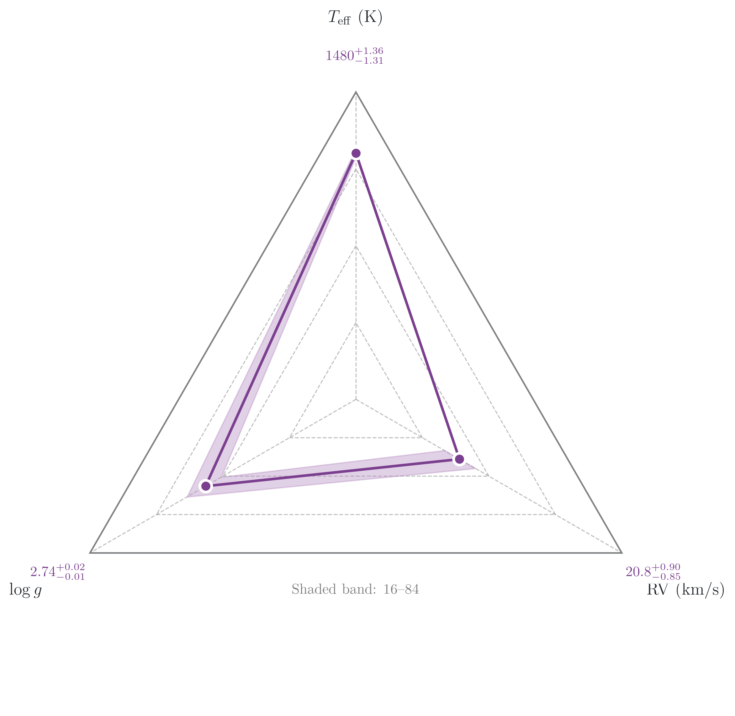
Section 4.1: Replacing axis labels and adding annotations#
The radar axes are standard matplotlib polar axes. Replace tick labels with LaTeX strings using set_xticklabels, then add a note with ax_radar.text(...).
[11]:
import numpy as np

n = len(results.free_parameters)
print(f"Free parameters ({n}): {results.free_parameters}")

# Replace these with your own LaTeX labels in the same order as free_parameters
custom_labels = [
    r'$T_{\mathrm{eff}}$ (K)',
    r'$\log g$',
    r'RV (km/s)',
][:n]   # truncate to match actual number of free parameters

fig_radar, ax_radar = plots.plot_radars()

ax_radar.set_xticklabels(custom_labels, fontsize=13)

ax_radar.text(
    0.5, 0.20,
    'Shaded band: 16\u201384% posterior quantiles',
    transform=ax_radar.transAxes,
    ha='center', va='top',
    fontsize=11, color='grey',
)

plt.show()
Free parameters (3): ['Teff', 'log(g)', 'rv']
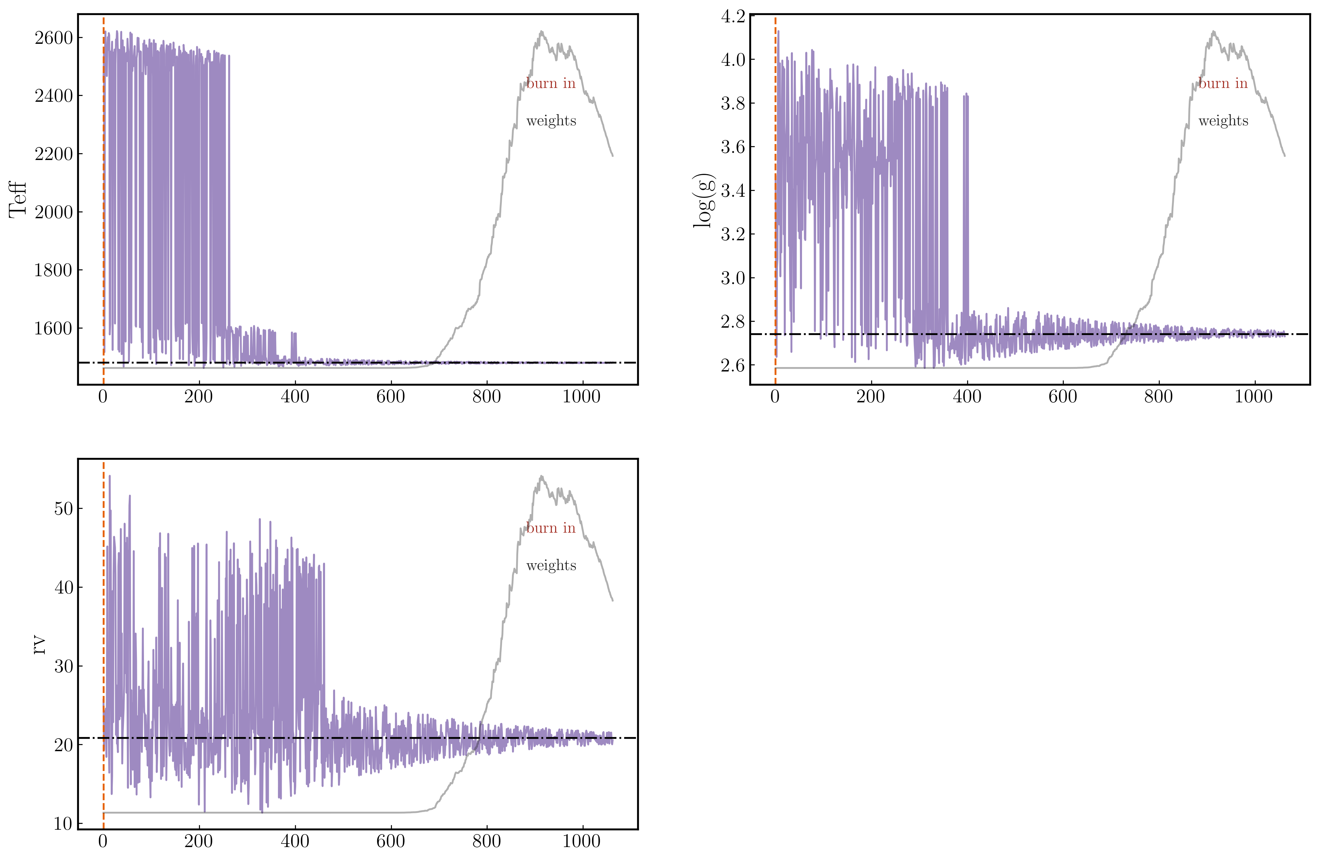
Section 5: Chains plot#
The chains plot shows the evolution of each sampled parameter over the course of the nested-sampling run — one panel per parameter, with samples in order.
Three overlays help you read convergence:
Burn-in marker (vertical dashed line): samples to the left are discarded; only those to the right enter the posterior.
Importance weights (right y-axis, grey trace): shows which part of the chain carries most of the posterior weight. A spike near the end is normal for NS.
Best-value line (horizontal line): marks the weighted posterior median.
[65]:
PLOTS_CONFIG.ChainsPlot.set_chains_plot_config(
    color_chains         = '#5E3C99',
    alpha_chains         = 0.6,

    color_plot_burn_in   = '#E66101',
    fontsize_burn_in     = 13,
    linestyle_burn_in    = '--',

    show_weights         = True,
    color_plot_weights   = '#1F1F1F',
    alpha_weights        = 0.35,
    fontsize_weights     = 13,

    plot_best_value      = True,
    color_best_value     = 'black',
    linestyle_best_value = '-.',
)

fig_chains, axs = plots.plot_chains()
plt.show()
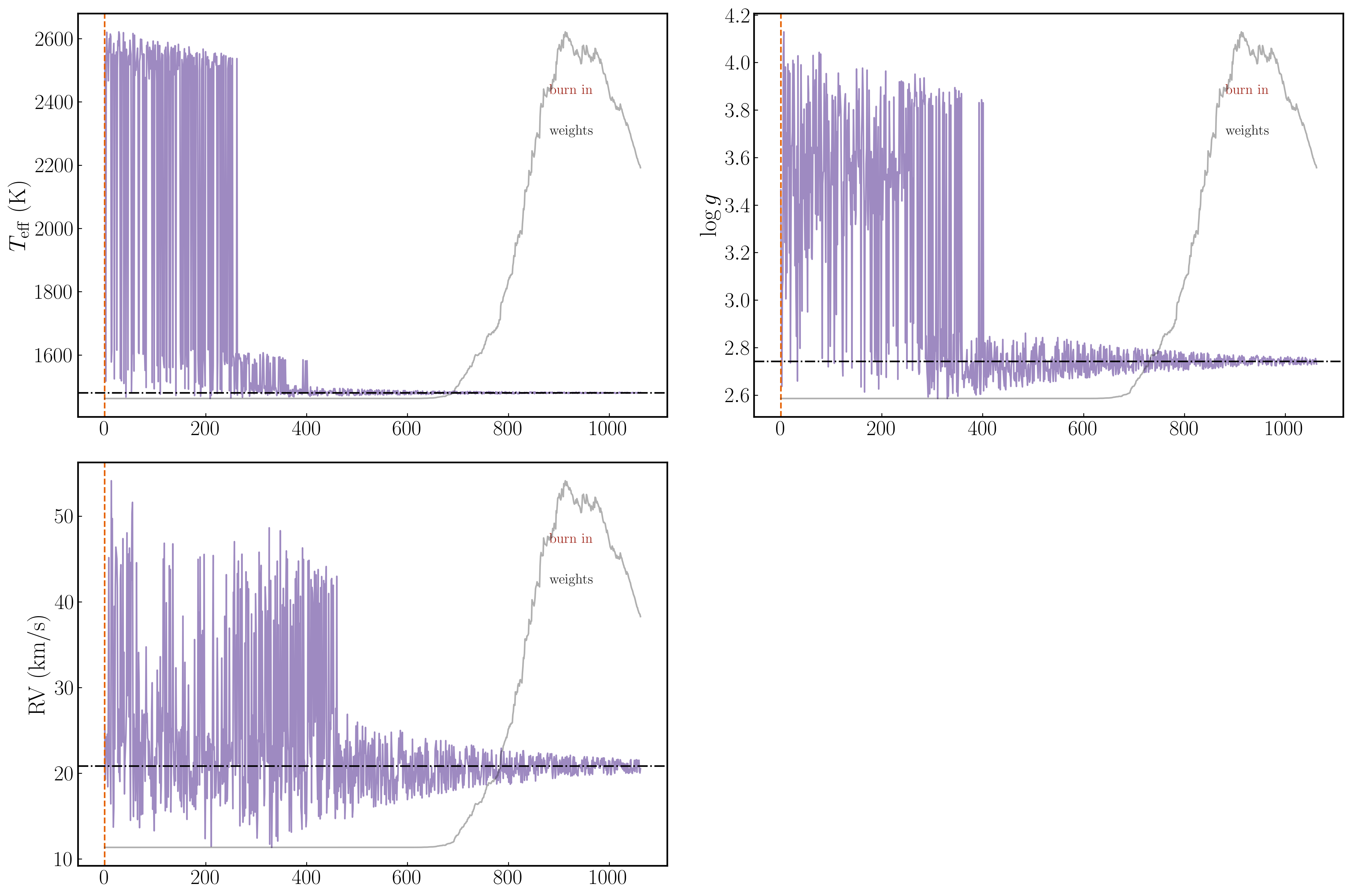
Section 5.1: Replacing y-labels#
axs is a list of Axes objects, one per free parameter, in the same order as results.free_parameters. Zip them with your custom labels to replace the defaults.
[67]:
fig_chains, axs = plots.plot_chains()

for a, name in zip(axs, custom_labels):
    a.set_ylabel(name, fontsize=22)
    a.tick_params(labelsize=20)

fig_chains.tight_layout()
plt.show()
Section 6: Saving figures#
All four plot functions return a Figure object. Call savefig directly on it to control format, DPI, and bounding box.
PDF vs PNG:
PDF (vector): preferred for journal submission. Lines and text scale to any size. DPI only affects raster fall-backs (e.g. very dense scatter plots embedded in the PDF).
PNG (raster): use for slides or talks where a vector renderer isn’t guaranteed. Use
dpi=300minimum for print;dpi=200is fine for screen.
Bounding box: bbox_inches='tight' trims whitespace around the figure. Almost always what you want for publication figures.
[ ]:
from pathlib import Path

out_dir = Path(".").resolve()

fig_corner = plots.plot_corner()
fig_corner.savefig(out_dir / "corner_custom.pdf", dpi=300, bbox_inches="tight")
fig_corner.savefig(out_dir / "corner_custom.png", dpi=200, bbox_inches="tight")
print(f"Saved: {out_dir / 'corner_custom.pdf'}")
print(f"Saved: {out_dir / 'corner_custom.png'}")

fig_radar, _ = plots.plot_radars()
fig_radar.savefig(out_dir / "radar_custom.pdf", dpi=300, bbox_inches="tight")
print(f"Saved: {out_dir / 'radar_custom.pdf'}")

fig_chains, _ = plots.plot_chains()
fig_chains.savefig(out_dir / "chains_custom.pdf", dpi=300, bbox_inches="tight")
print(f"Saved: {out_dir / 'chains_custom.pdf'}")
Section 7: Next steps#
Tutorial 8 — Statistical Tests and Model Selection: Compute reduced χ², log-evidence, effective sample size, AIC/BIC, and Bayes factors from your ForMoSA results. Compare models and report them correctly in a paper.
API docs:
docs/api/forPlotting,NSResults,PlotsConfig,MAIN_PLOT, and all config dataclasses with their full parameter lists.